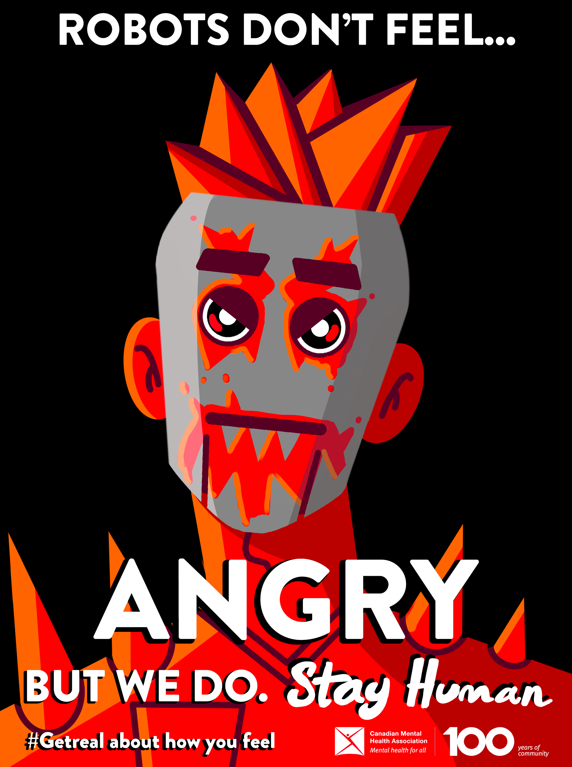
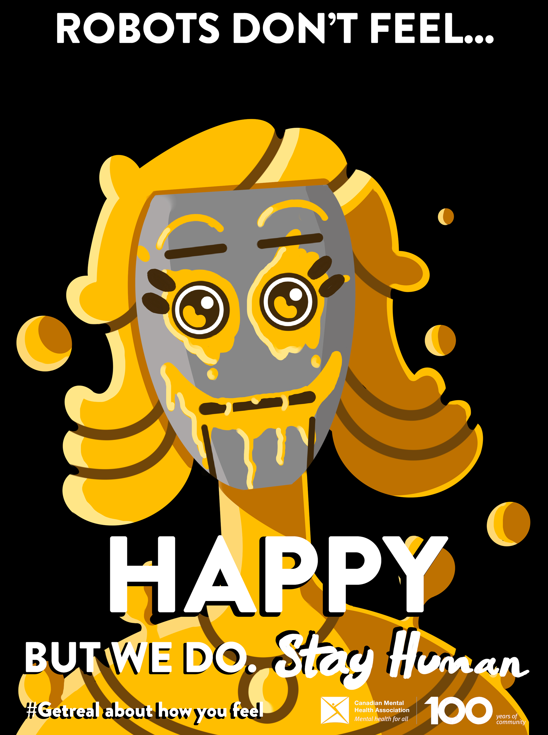
I went into this project with the goal of creating a mental health poster that evoked strong emotions in its viewers. I wanted to show people that it’s ok to feel sad, happy, or even angry. Our emotions make us feel alive, and we shouldn’t hold them back. Hence the tagline "Robots don't feel, but we do" and that we shouldn't be ashamed of our emotions.
My initial design was a robotic head that featured colourful explosions of emotion. However, it lacked the crucial human element needed in mental health advertisements, and there was too much text. As such, I changed the tagline and instead created a series of posters that each focused on their own emotion. This allowed me to use specific colours and values to demonstrate the correct moods for each design. I created exaggerated and simplified human characters for the posters, as that would help me gain an emotional response. They were all unique to demonstrate how we all, despite our differences, experience the same emotions. We can all feel sad sometimes. They all wear grey masks to cover their faces and expressions. I chose to represent their feelings “leaking through” with spray-painted faces on the front of the masks.
My initial design was a robotic head that featured colourful explosions of emotion. However, it lacked the crucial human element needed in mental health advertisements, and there was too much text. As such, I changed the tagline and instead created a series of posters that each focused on their own emotion. This allowed me to use specific colours and values to demonstrate the correct moods for each design. I created exaggerated and simplified human characters for the posters, as that would help me gain an emotional response. They were all unique to demonstrate how we all, despite our differences, experience the same emotions. We can all feel sad sometimes. They all wear grey masks to cover their faces and expressions. I chose to represent their feelings “leaking through” with spray-painted faces on the front of the masks.
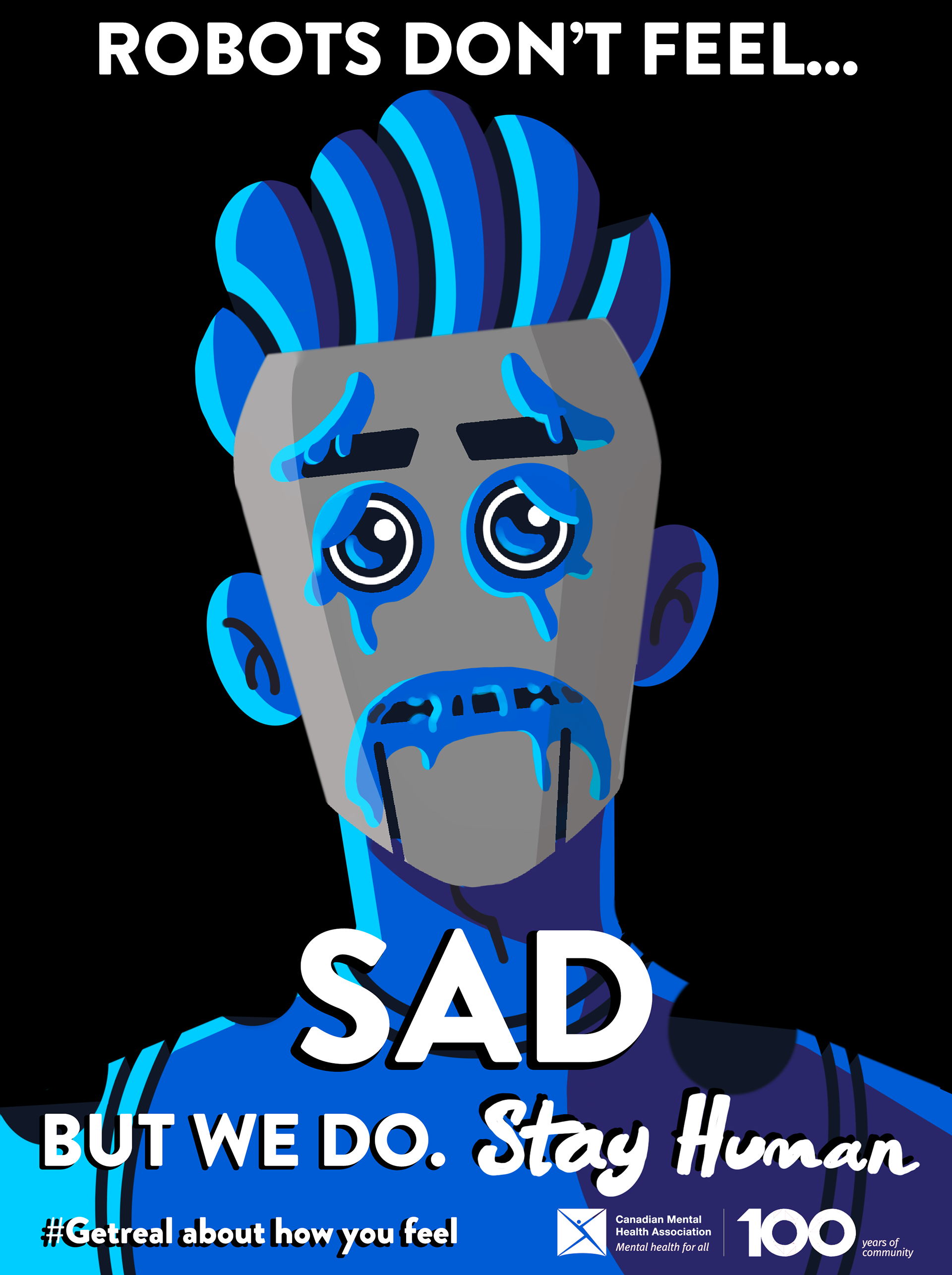
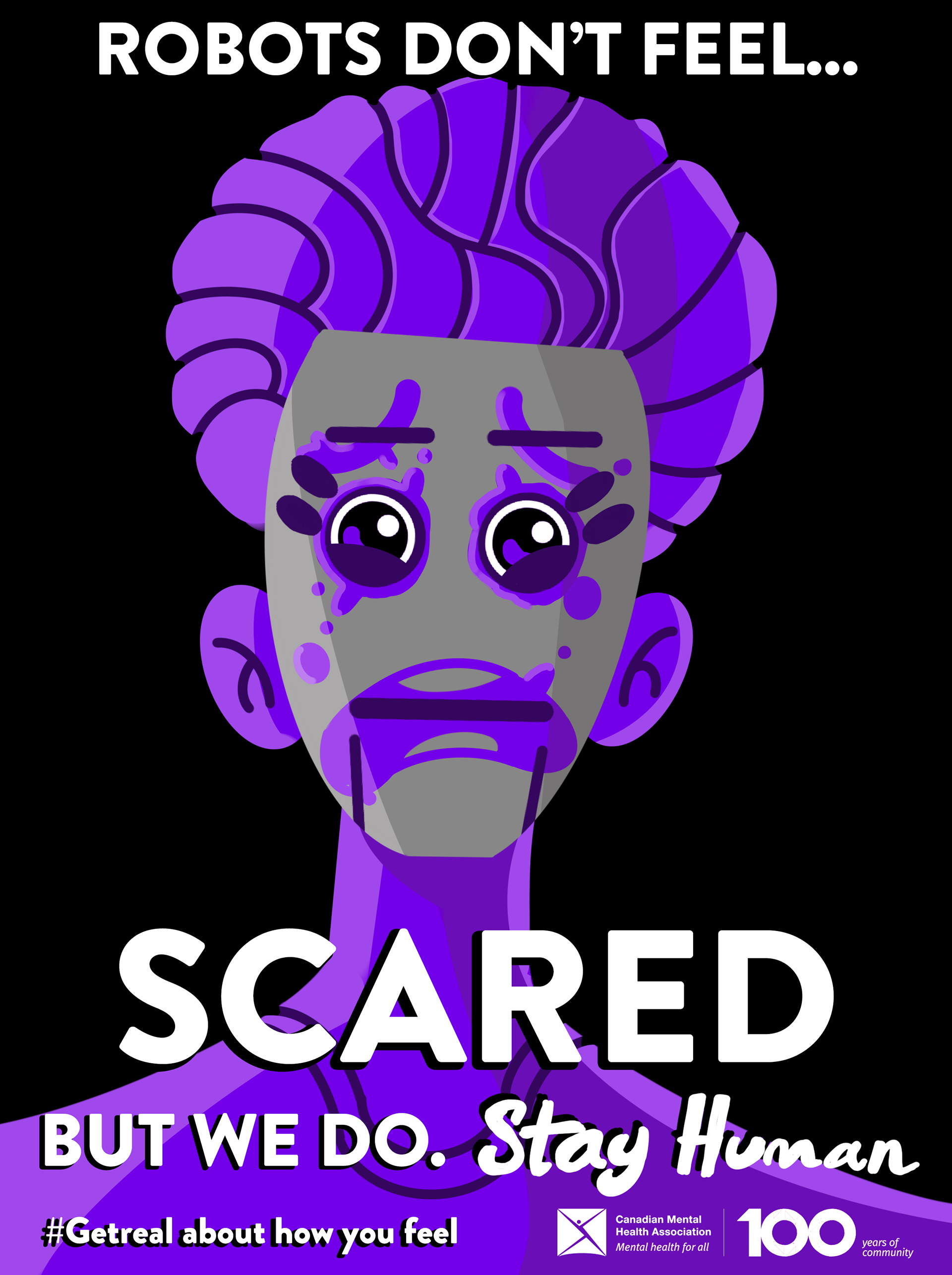
Each mask represents a different emotion, which I accentuated by using shape language and colour theory.
Each shape was selected to help convey the desired emotion for the image. For example, the Sad poster uses mostly rounded shapes, droopy circles, and blobs. On the other hand, I used very pointy and angular shapes, like triangles, to convey the energy of anger in the red poster.
I made the mask’s shapes largely geometric as they are unnatural and sterile, which provides great contrast with the biomorphic shapes present in the human forms. I also used concave shapes and illusion to make it look like circles are being cut out of the people, which refers to the saying, “it’s eating away at you.”.
I made the mask’s shapes largely geometric as they are unnatural and sterile, which provides great contrast with the biomorphic shapes present in the human forms. I also used concave shapes and illusion to make it look like circles are being cut out of the people, which refers to the saying, “it’s eating away at you.”.
