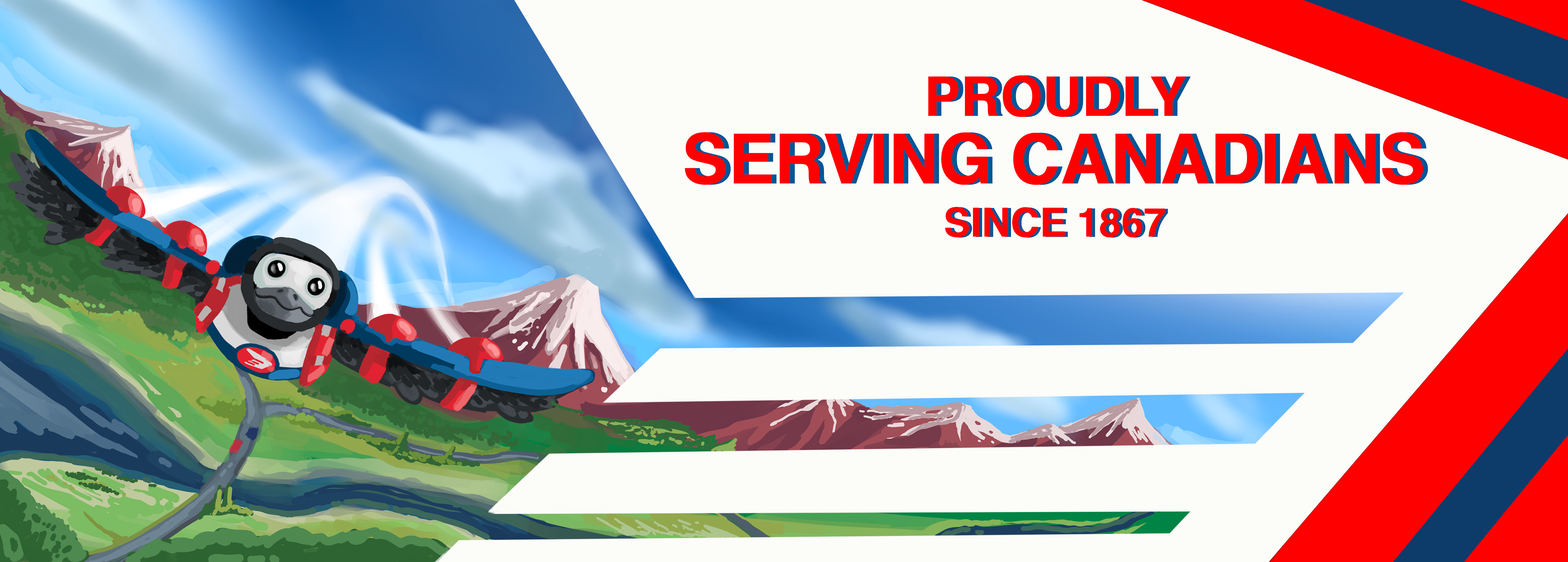
When designing Gerald, I tried to analyse and understand the values of Canada Post, as well as the imagery that represented them. I found that they value respect, reliability, equality, and efficiency, and I also noted that Canada Post has been operating in Canada since 1867 when our country was founded. This is why I decided to use patriotism and Canadian pride as the primary source of inspiration for the commercial.
History
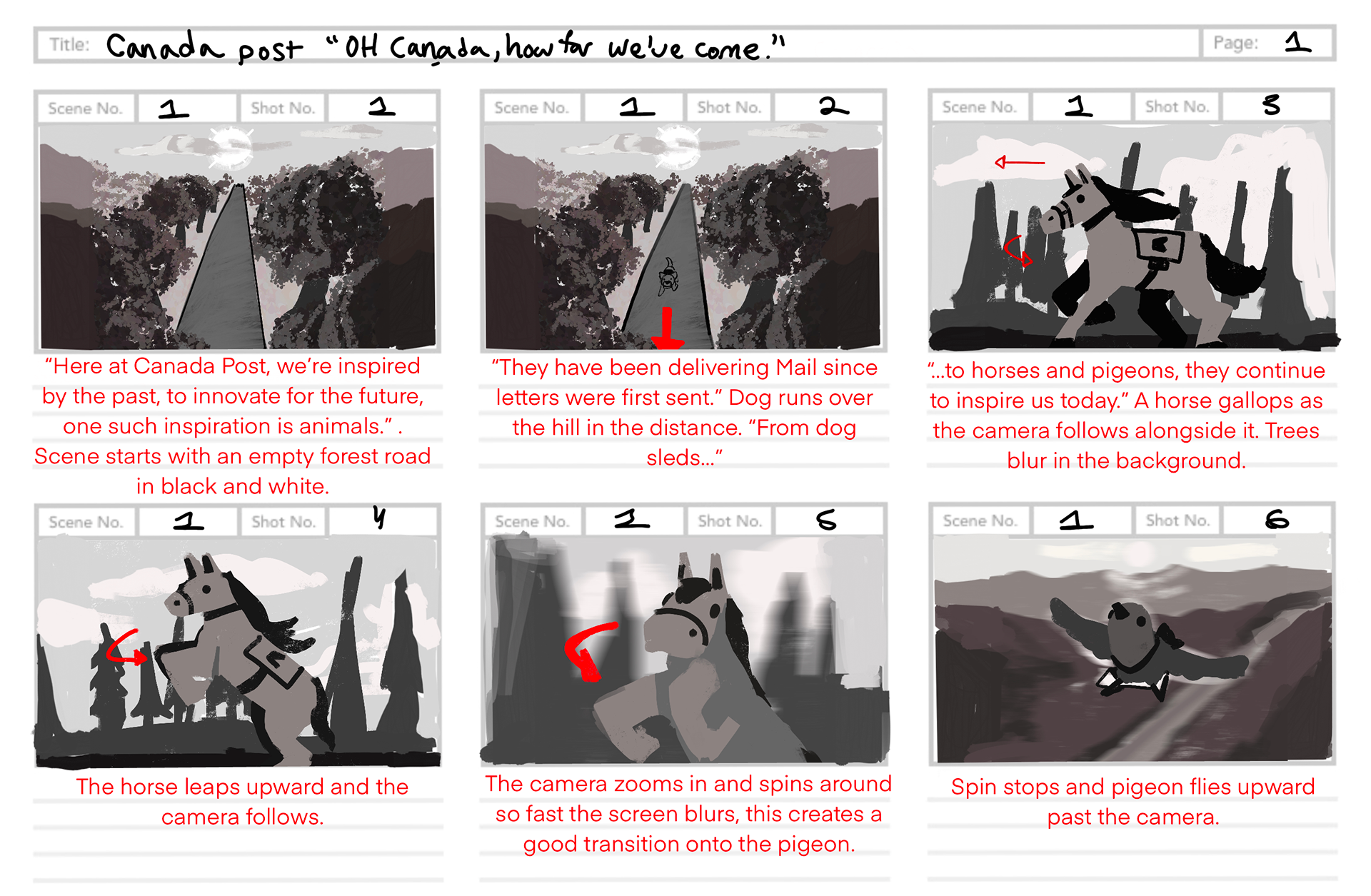
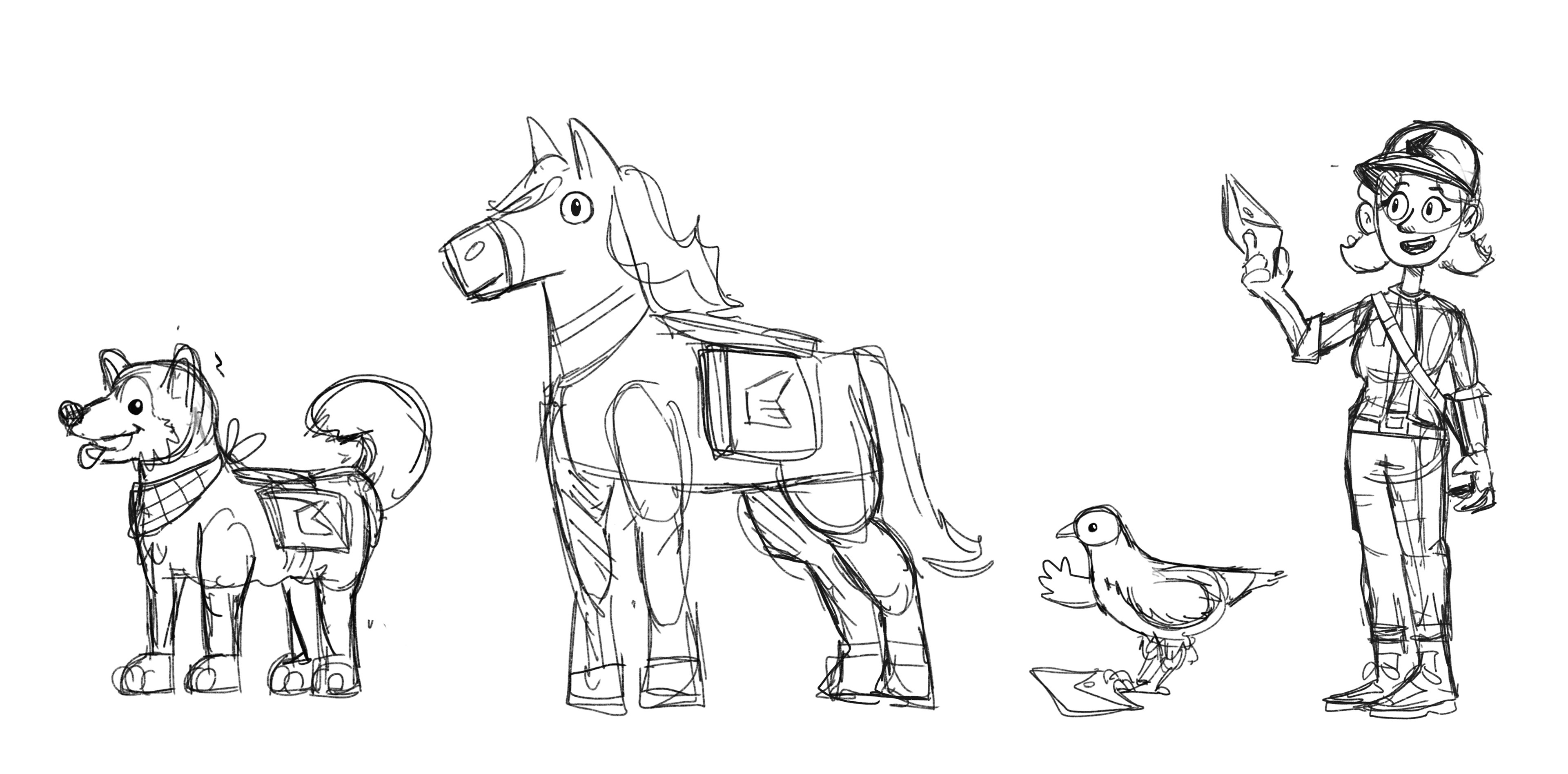
Having been around for so long, I wanted to highlight the different ways mail has been delivered over the last 150 years. Upon researching, I found that animals were integral to mail delivery, especially before modern methods became commonplace.
As such, I chose to highlight a horse, a dog, and a pigeon in the ad, as they were all animals that had helped deliver mail in the past. They are meant to show the history and the steps the mail industry took to get to today.
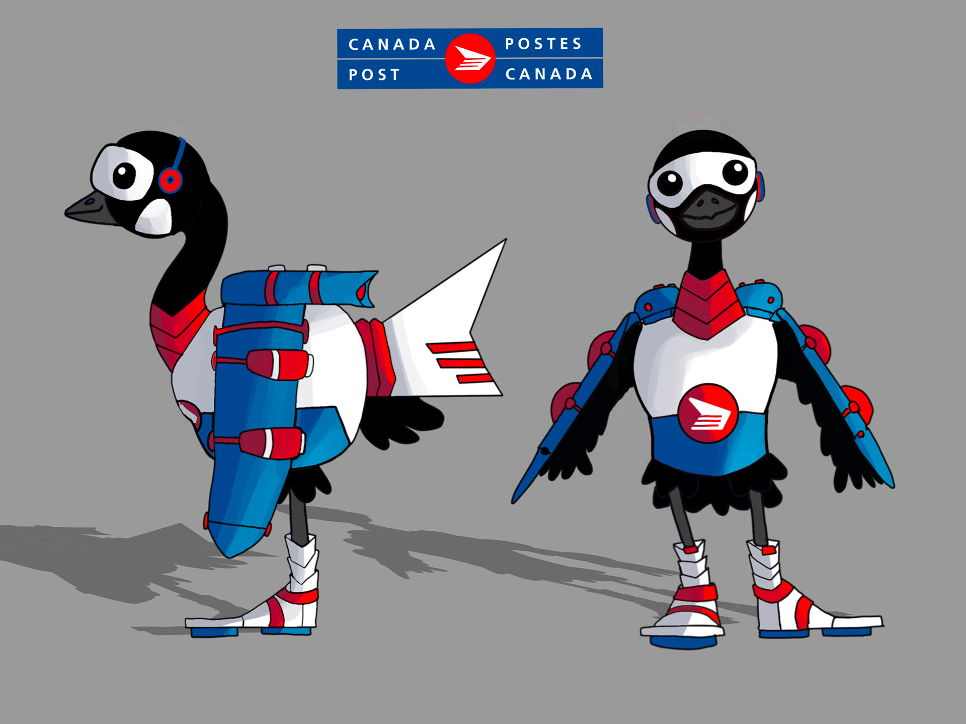
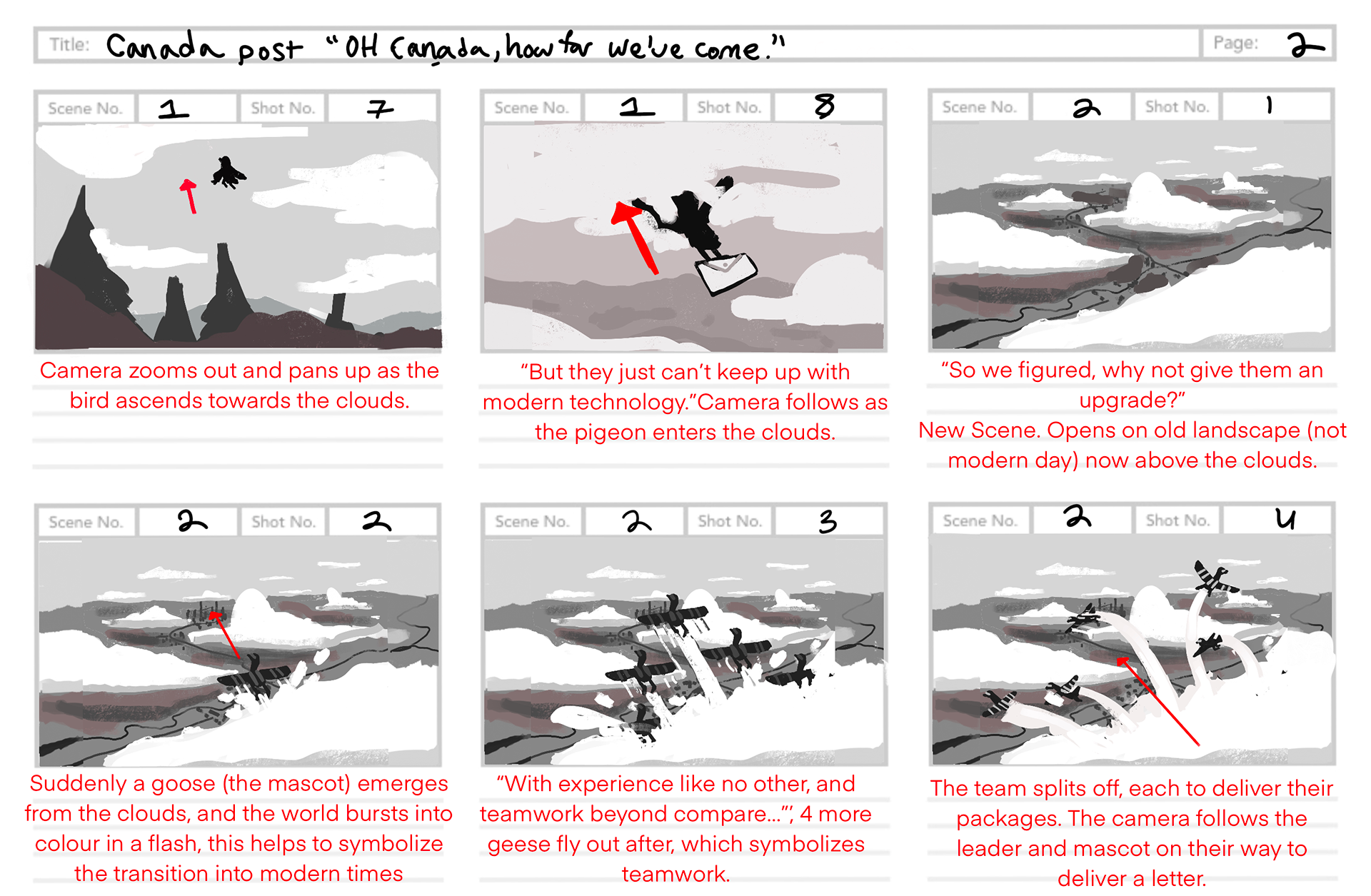
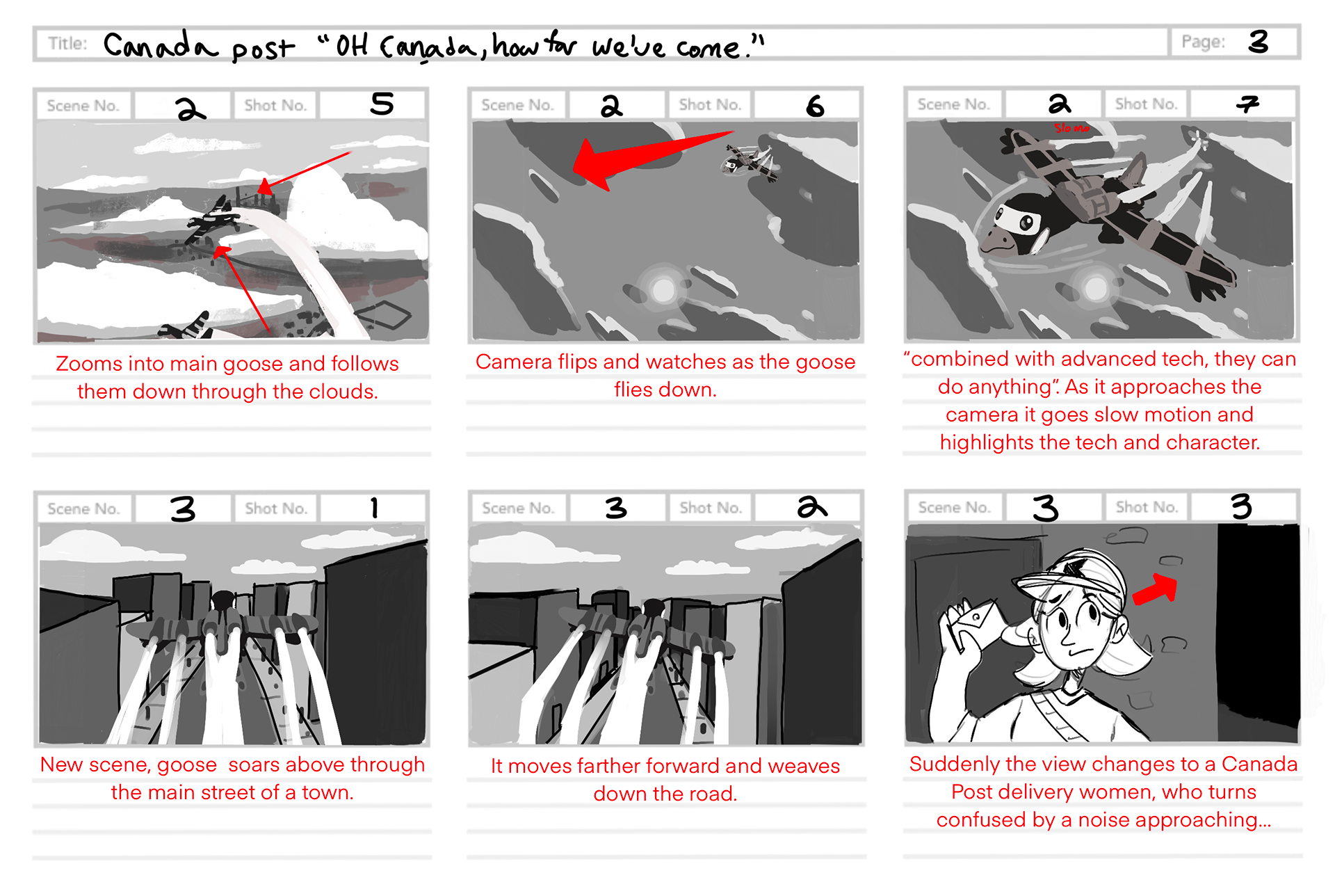
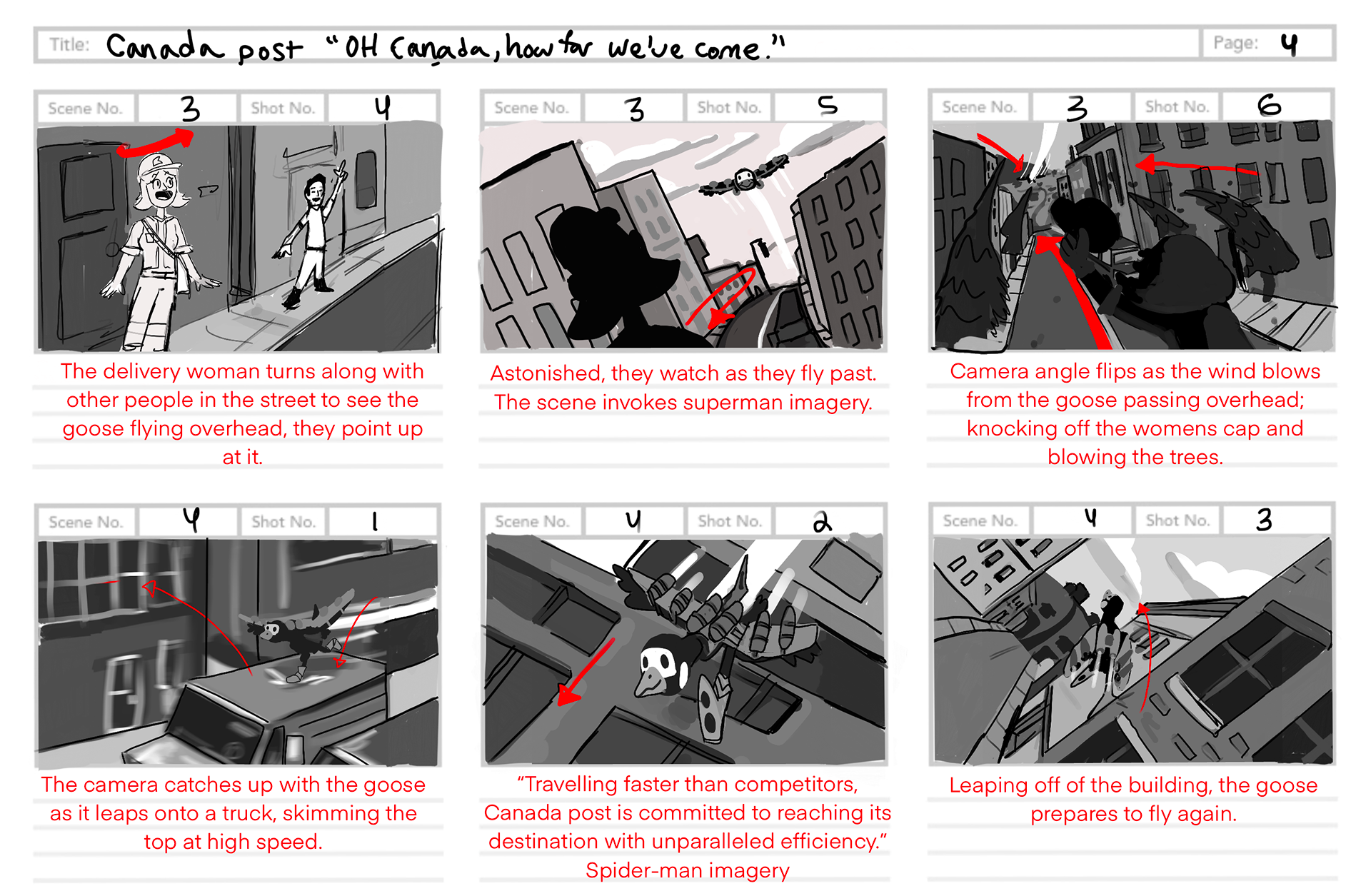
I created the mascot around innovation and the revitalization of old ideas. I settled on the Canada goose as it was not only a Canadian symbol but, as a bonus, people often think of birds when thinking about mail delivery. I wanted to put a spin on that by taking a national symbol like the Canada goose and then equipping it with modern technology and Canada post colours.
Other parallels include that geese are also known for flying in large v-like formations, not unlike the angles in Canada post’s logo.
They also migrate every winter and travel extremely long distances, as the mail people send daily.
Process Work
Early Mascot Concept
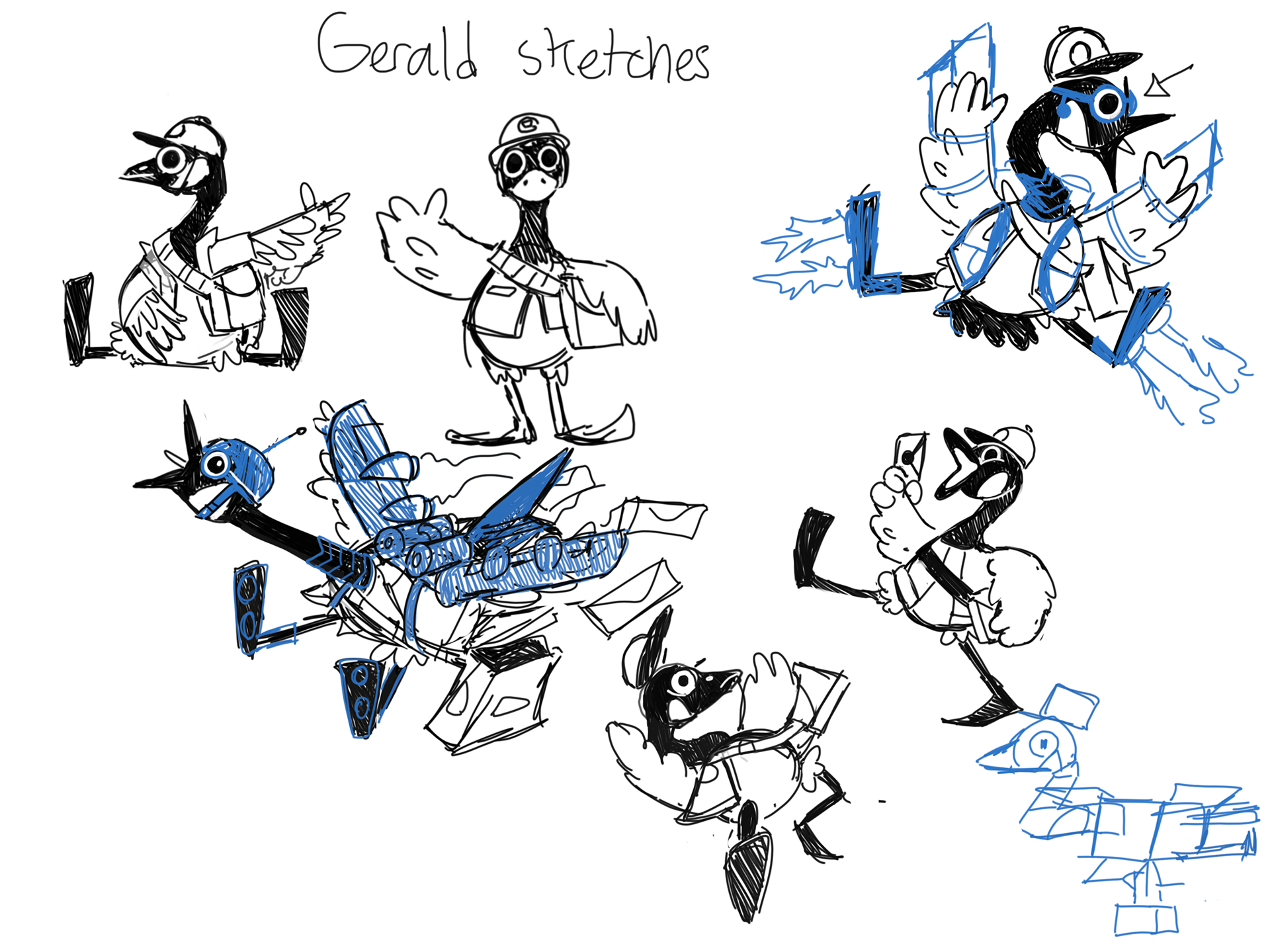
secondary character early design sketches
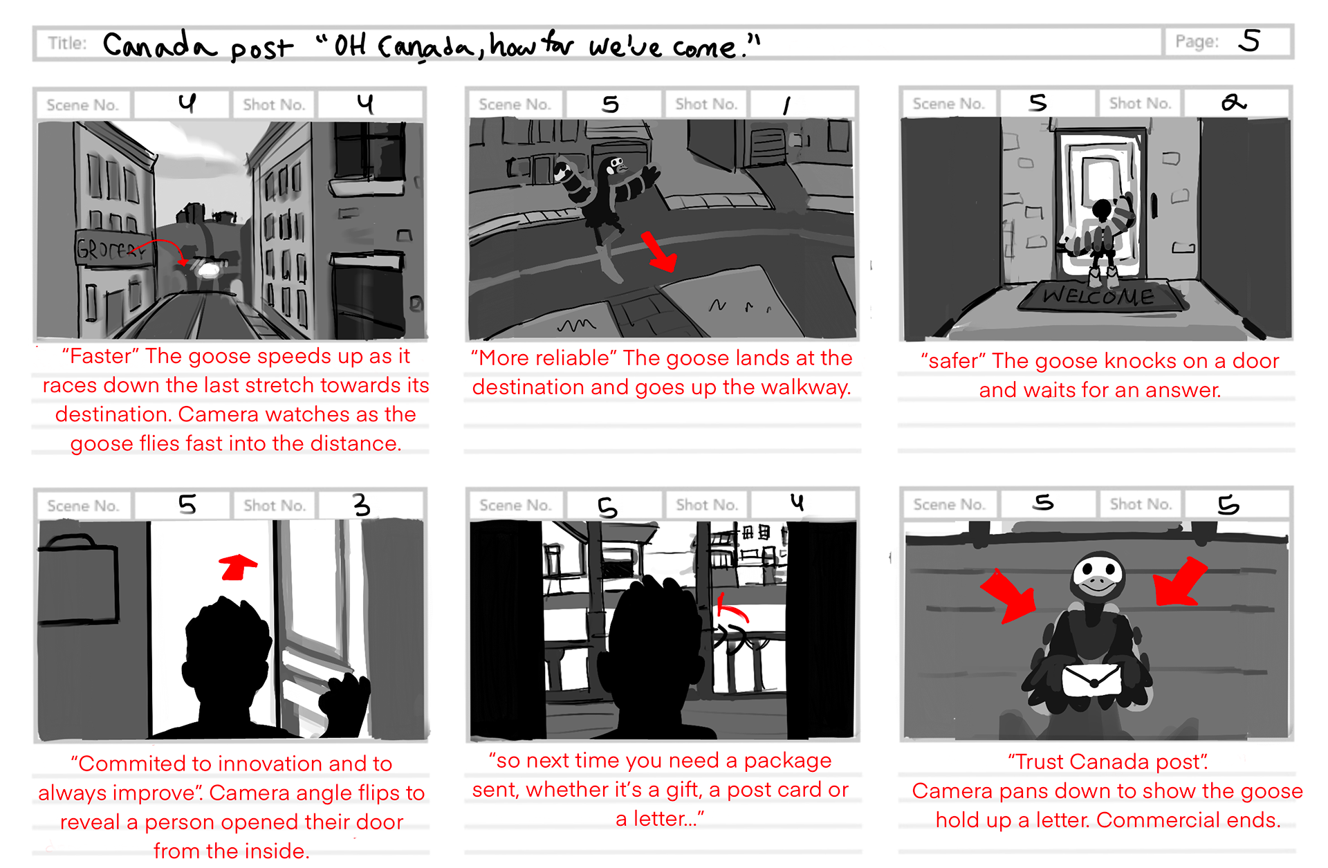
Storyboard